The Problem
Dynolicious was one of the first performance-tracking apps for mobile devices, but its interface and UX had not evolved alongside mobile design standards. With competition growing, the app needed a modern redesign to improve usability, boost sales, and align with Apple's evolving expectations for premium apps.
Role & Scope
- Role: Lead UX/UI Designer
- Timeline: Multi‑release redesign
- Partners: iOS engineering, QA, marketing
- Surface area: Telemetry screens, test workflows, theming, App Store assets
Constraints
- iOS Human Interface Guidelines and performance constraints.
- Legacy code and data structures; needed to minimize rework.
- Serving both casual users and hardcore enthusiasts without clutter.
The Challenge
The original app struggled with complex data presentation, an outdated UI, and declining engagement. The challenge was to:
- Make performance data more accessible through improved data visualization.
- Create a clean, modern UI that aligned with Apple's design language.
- Maintain brand credibility while differentiating from competitors.
- Improve usability for both casual users and hardcore automotive enthusiasts.
The Process
UI Redesign
I streamlined the interface by simplifying layouts, reducing cognitive load, and improving visual hierarchy for key performance data. The result was an app that felt faster, cleaner, and more intuitive.
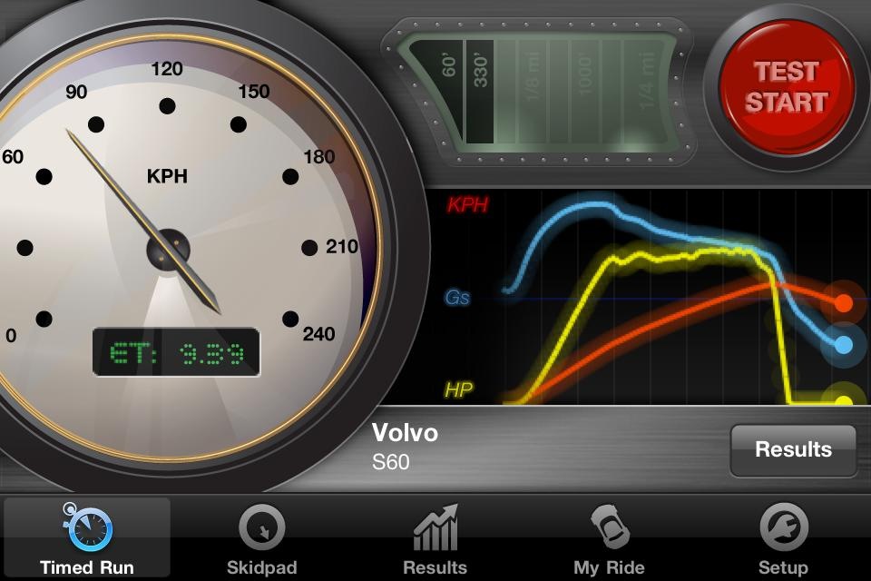
Data Visualization Enhancements
I transformed raw performance data into interactive, easy-to-understand charts and metrics, making insights more actionable for users.
Modern Aesthetic
I crafted a sleek, high-performance visual style that appealed to both Apple’s design philosophy and automotive enthusiasts, ensuring the app looked premium and authoritative.
App Store Optimization
Beyond UX, I ensured that Dynolicious was positioned to stand out in the App Store, updating app icons, preview imagery, and branding to make the app more attractive to new users.
Success Snapshot
Users
0k paid users
Performance
0k tests run
Reviewed
0k 5‑star reviews


Outcomes and Impact
- Increased Sales by 250%: The redesigned app saw a major boost in downloads.
- Featured in Apple Stores: Dynolicious was highlighted as a leading performance app.
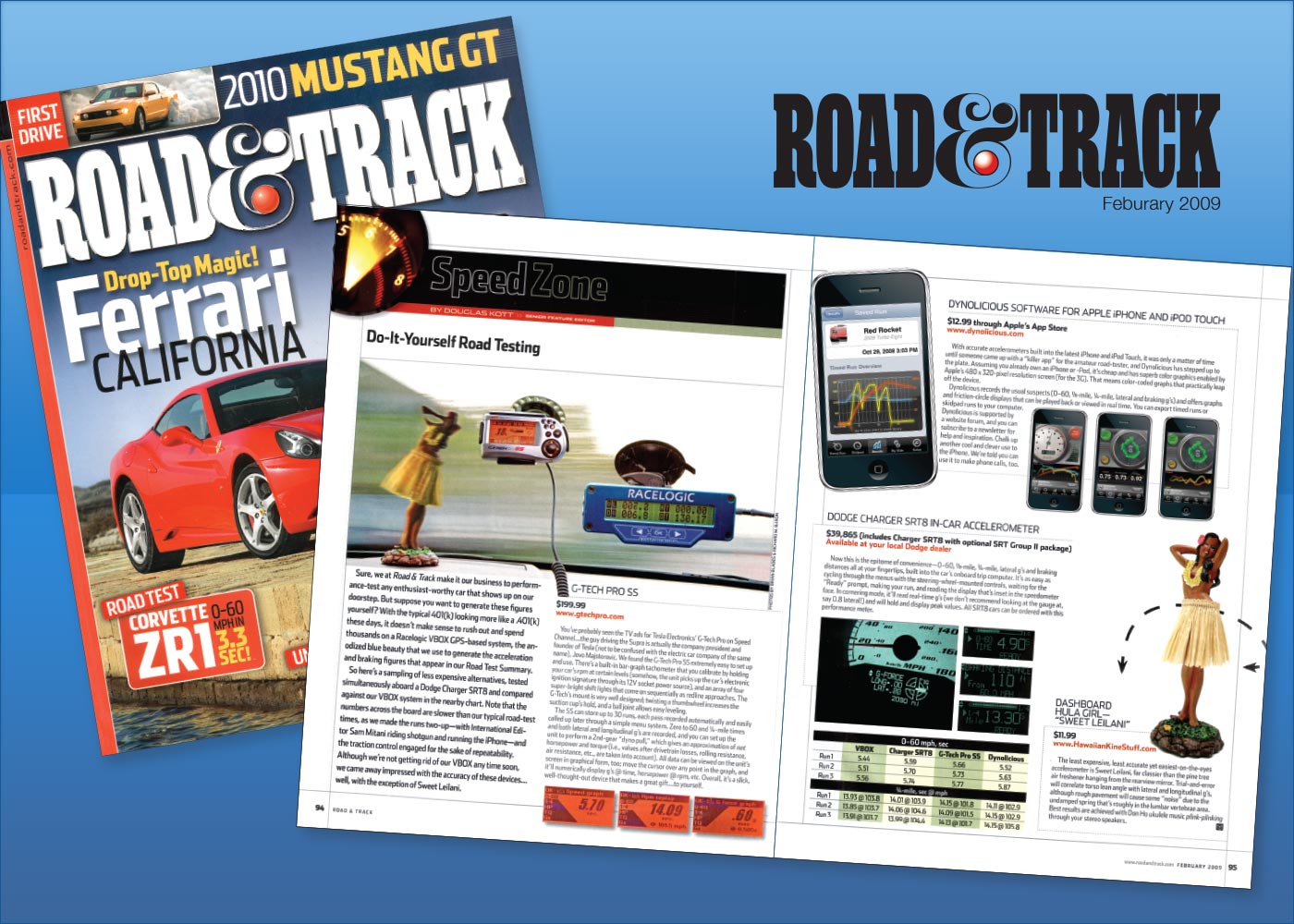
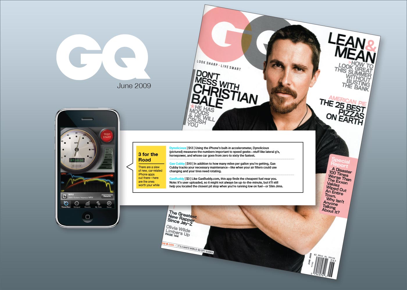
- Industry Recognition: Positive coverage from Road & Track, Car & Driver, and AutoBlog.
- Higher User Retention: Improved UX led to more repeat usage and longer session times.
- Sales/feature: App Store Connect reports and promo placement logs.
- Reviews: store review counts (5‑star tally) over time.
- Retention: session length and repeat use from analytics.
Reflection
The Dynolicious redesign reinforced the importance of blending UX, data visualization, and brand positioning. By focusing on usability, modern aesthetics, and App Store strategy, I helped re-establish Dynolicious as a leader in performance-tracking apps.