Context
This Health & Wellness App is a peer-support app for people in recovery. Over four years, it reached 1M downloads and 150K daily users, but retention collapsed: only 5% of new users were active four weeks post-download, despite increased ad spend.
My Role
As Lead UX/UI Designer, I was tasked with reversing retention decline, aligning product expectations with delivery, and creating a design system scalable to future features.
The Challenge
User research surfaced three systemic problems:
- Onboarding was onerous : 10–15 minutes, causing drop-off.
- Expectation mismatch : advertised features didn’t deliver, leading to fast abandonment.
- Fragmented design : Android and iOS experiences diverged, creating confusion and eroding trust.
Stakeholders wanted results fast, but the risk was alienating the loyal core audience.
Strategic Decision
Rather than tackling everything at once, I focused on the sober timer, the app’s flagship feature. Research showed many users downloaded the app primarily for a reliable sobriety tracker. If we failed them here, no downstream feature mattered.
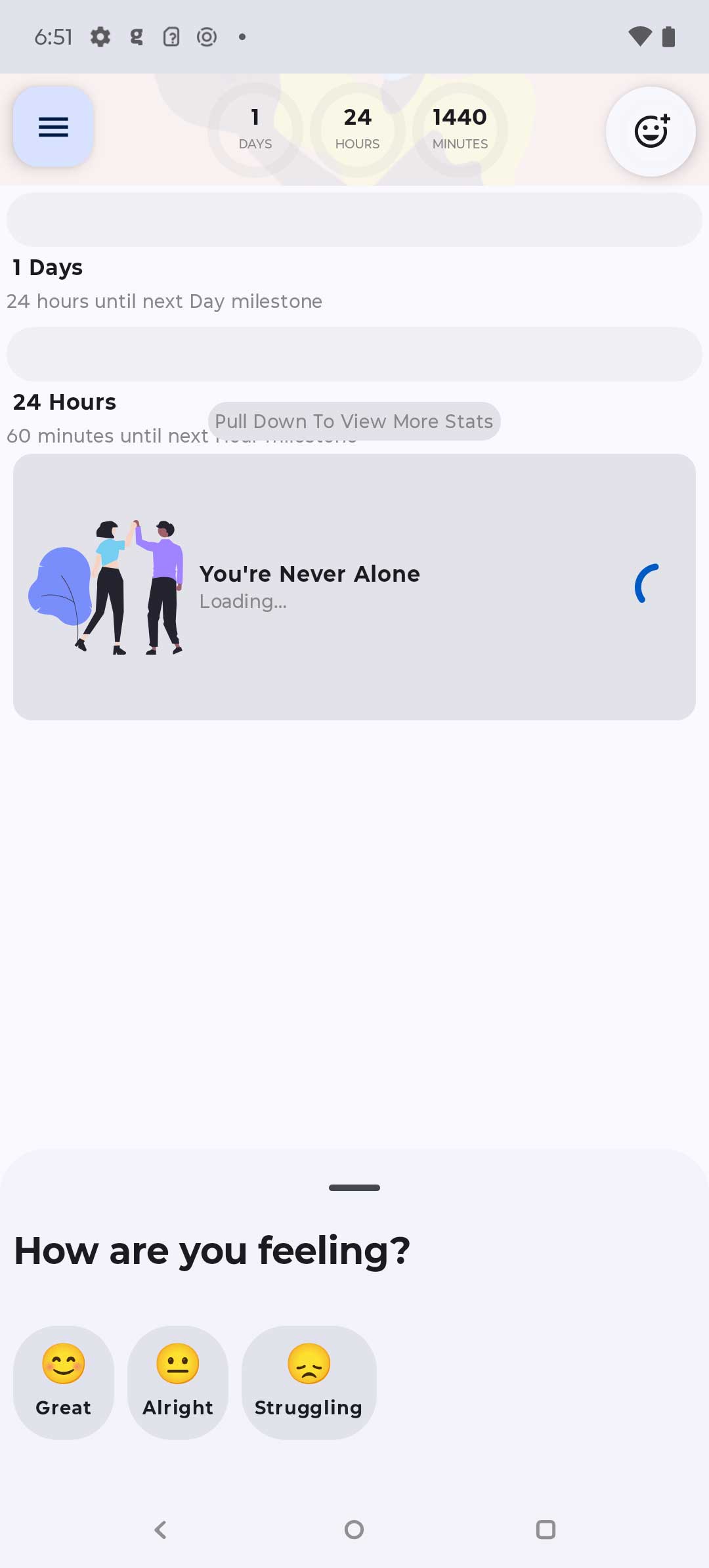
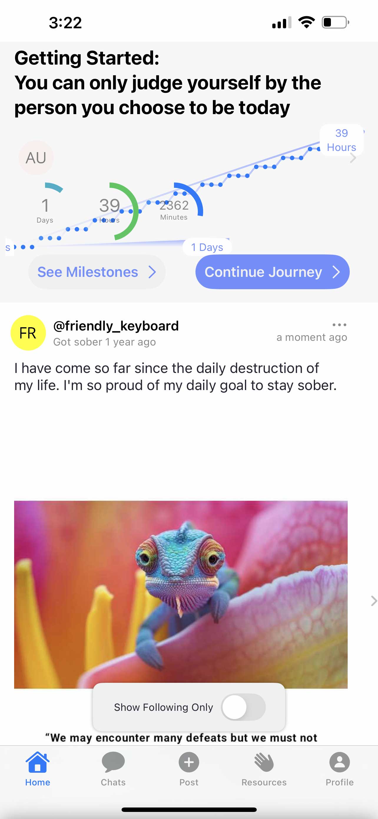
Not only was the sober timer different on each platform, it was a complete mess.
Process
Competitive Benchmarking
- Conducted a structured audit of 12 competing sobriety apps.
- Built a feature matrix highlighting strengths (e.g., milestone celebrations, personalization) and weaknesses (e.g., cluttered dashboards).
- Synthesized findings into design principles: clarity, consistency, celebration.
User Insights
- Interviewed 15 users who had churned within 30 days.
- Findings: the timer felt unreliable, inconsistent across platforms, and lacked emotional resonance.
- Quote: “If the timer doesn’t work right, why should I trust the community?”
Design & Iteration
- Wireframes tested with 20 users to validate information hierarchy.
- Accessibility audit led to improved contrast, tap targets, and VoiceOver compliance.
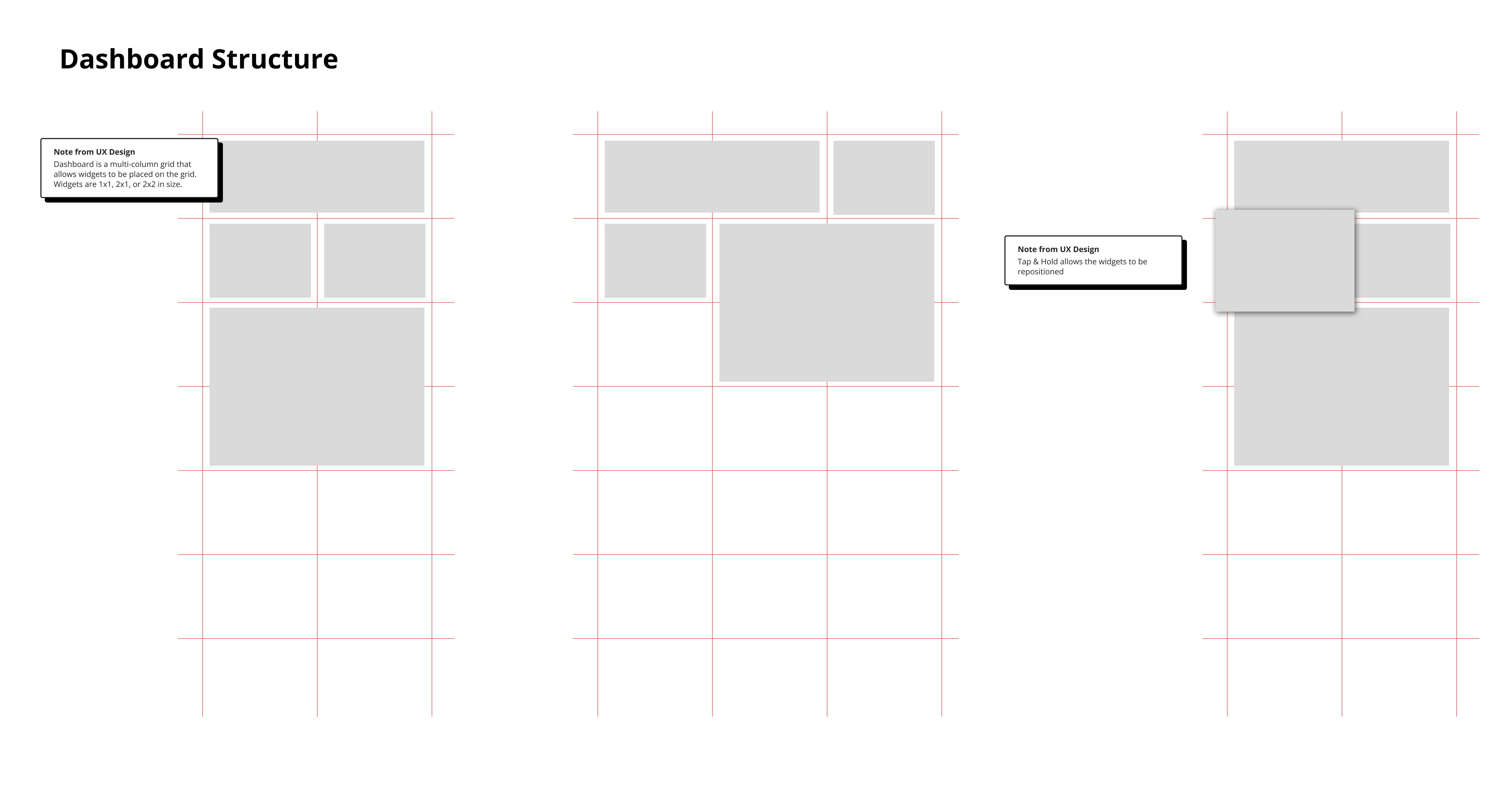
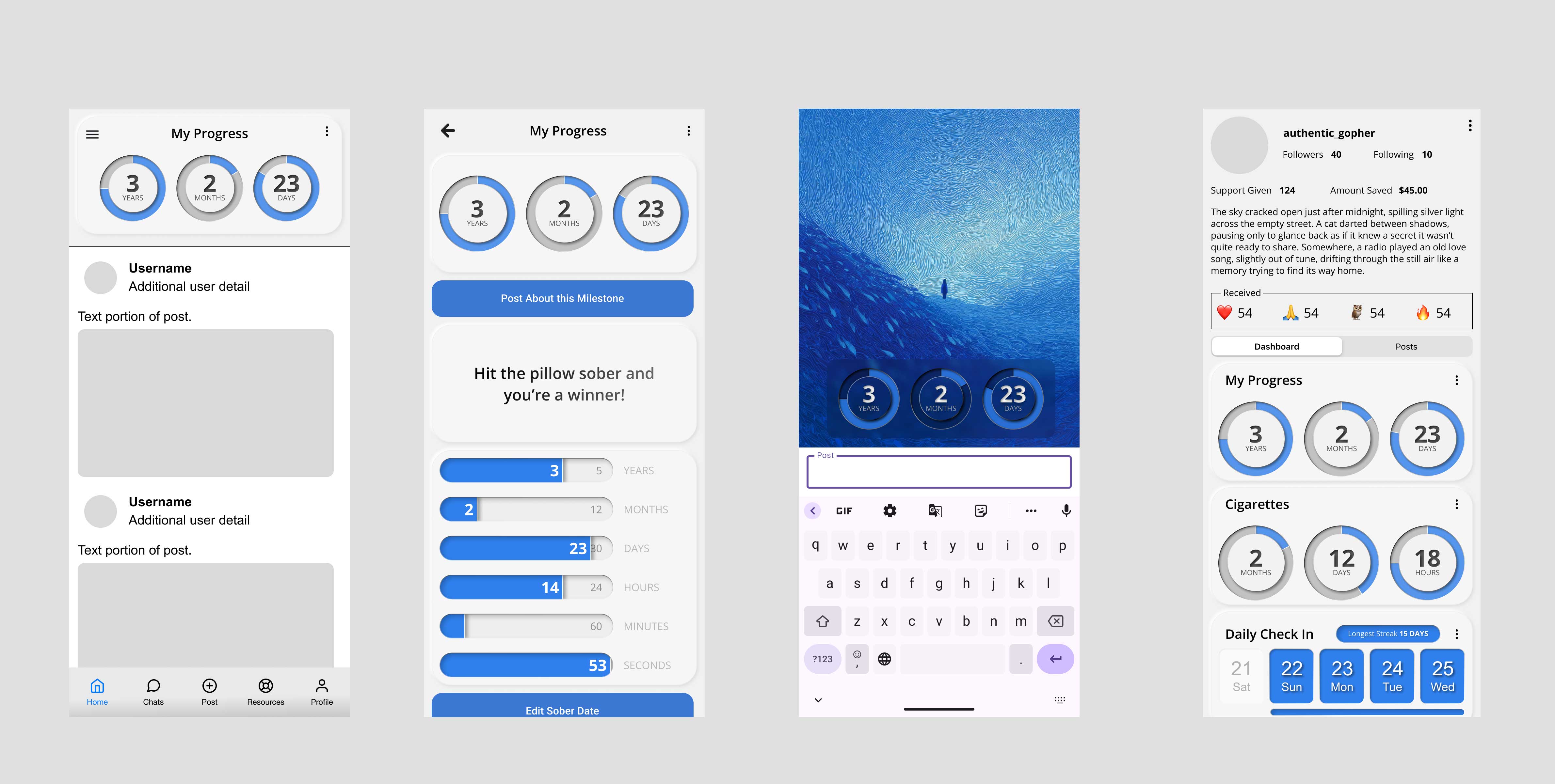
- Iterated toward a modular widget framework, turning the timer into the first in a suite of configurable dashboard widgets.
Stakeholder Alignment
- In a key leadership meeting, I pitched: “What if the timer wasn’t just fixed, but became the foundation of a scalable dashboard ecosystem?”
- This shifted the project from a patch to a platform vision, gaining buy-in for a multi-phase rollout.
The Dashboard
The core of the solution was the dashboard; a widgetized framework allowing users to rearrange and personalize their experience. This created a scalable design system that would enable future features (gratitude journals, streak tracking, peer-support, and more).

Outcomes and Impact

- Retention quadrupled: from 5% → 22% four-week active users post-launch.
- 250% increase in returning users directly attributable to timer redesign (validated via cohort analysis).
- Established a widget framework that became the backbone of all future feature launches.
Reflection
- What worked: Anchoring design decisions in user research, tying deliverables to business metrics, and reframing a tactical fix into a strategic platform shift.
- What I’d do differently: Formalize cross-functional rituals earlier. Engineering initially struggled to adapt to design-driven iteration, causing churn I could have preempted.
Takeaway
Design is not decoration. By aligning user needs (trust in the timer) with business goals (retention + ad ROI), we delivered both immediate wins and a scalable framework for growth.